In today’s data-driven world, the ability to understand and interpret data is no longer optional—it is essential for professionals across industries. Whether you are entering business, finance, healthcare, or technology, having foundational skills in beginner data visualization and data science techniques for beginners is critical. This data visualization guide aims to provide a step-by-step roadmap for new professionals looking to learn the fundamentals, apply analytics effectively, and tell compelling stories with data.
Understanding Data Science for Beginners
Introduction to data science begins with understanding the process of collecting, analyzing, and interpreting data to derive meaningful insights. Data science combines elements of statistics, computer science, and domain expertise to solve problems and inform decision-making.
For beginners, data science may seem overwhelming due to its technical depth. However, by focusing on fundamental principles, anyone can develop the skills to work confidently with data. Key components include:
- Data Collection: Gathering raw data from internal systems, public datasets, or external sources.
- Data Cleaning: Ensuring accuracy by removing duplicates, correcting errors, and standardizing formats.
- Data Analysis: Using statistical and computational methods to identify patterns, trends, and relationships.
- Data Visualization: Transforming analytical results into clear, visual insights for stakeholders.
By understanding these steps, beginners gain a foundation for applying data science techniques for beginners in practical scenarios.
What is Data Visualization?
Data visualization is the graphical representation of data to help users understand patterns, trends, and correlations. A well-designed visualization makes complex data accessible, interpretable, and actionable. For beginners, visualization is often the most intuitive entry point into data science because it combines creativity with analytical thinking.
Key Benefits of Data Visualization for Beginners
- Simplifies Complexity: Converts raw numbers into charts, graphs, and dashboards.
- Enhances Understanding: Makes patterns and trends obvious for decision-makers.
- Supports Storytelling: Facilitates data storytelling basics to communicate insights effectively.
- Drives Actionable Insights: Encourages decisions based on evidence rather than assumptions.
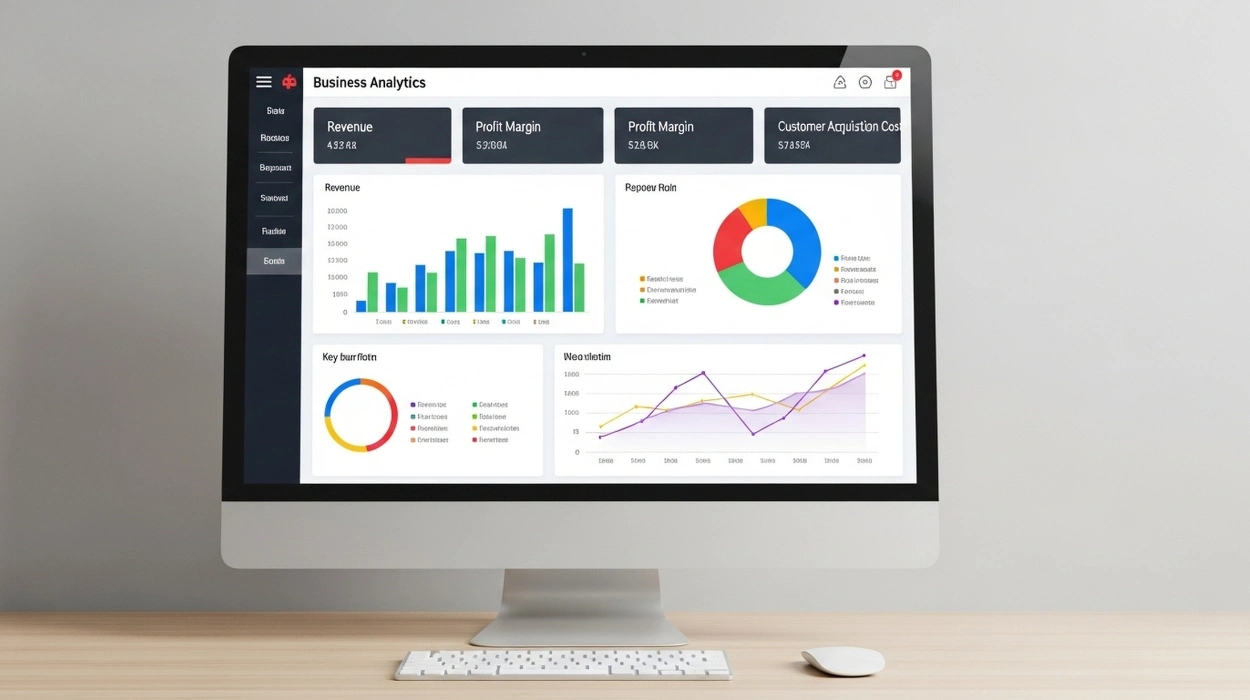
Beginner data visualization often starts with simple charts such as bar charts, line graphs, scatter plots, and pie charts. Over time, learners can progress to advanced visuals like heat maps, geospatial charts, and interactive dashboards.
Step-by-Step Guide to Learning Data Visualization
For new professionals, a structured approach to learning data visualization ensures faster mastery and practical application.
Step 1: Understand Your Data
Before creating visuals, it’s crucial to analyze your dataset. Ask questions like:
- What is the purpose of this data?
- Who is the audience for my visualization?
- Which variables are most important to highlight?
This ensures that your visualizations are relevant and focused on insights that matter.
Step 2: Start with Basic Charts
Beginner-friendly visualizations include:
- Bar Charts: Compare categories or track changes over time.
- Line Graphs: Show trends or continuous data.
- Pie Charts: Illustrate proportions.
- Scatter Plots: Reveal relationships between variables.
Practicing with these visuals helps reinforce understanding of data relationships and improves analytical thinking.
Step 3: Learn Visualization Tools
Several tools are ideal for beginners to create effective visuals:
- Excel: Accessible, easy-to-use, and sufficient for most basic tasks.
- Tableau Public: Free platform for interactive dashboards and visual storytelling.
- Power BI: Enterprise-grade analytics platform for professionals.
- Python (Matplotlib, Seaborn): For those interested in programming-based visualization.
Step 4: Apply Data Storytelling Basics
Visualization is not just about charts—it’s about communicating a story. Beginners should focus on:
- Highlighting key insights, not every data point.
- Using color and layout to guide attention.
- Providing context to make visuals meaningful.
This aligns with the core of data storytelling basics, which ensures your visualizations lead to informed decisions.
Step 5: Explore Advanced Techniques Gradually
Once comfortable with basics, learners can explore:
- Interactive Dashboards: Allowing users to filter and drill down into data.
- Heat Maps and Geospatial Visuals: Visualizing intensity and location-based patterns.
- Predictive Visuals: Using data science models to visualize future trends.
Data Science Techniques for Beginners
While visualization provides clarity, underlying analytical skills are essential to extract actionable insights from data. Beginners should focus on:
1. Descriptive Analytics
Summarizes historical data to understand trends and patterns. Examples include:
- Mean, median, and mode calculations
- Frequency distributions
- Trend analysis through line graphs
2. Exploratory Data Analysis (EDA)
A critical step in understanding dataset characteristics and identifying anomalies. Techniques include:
- Correlation analysis
- Box plots to detect outliers
- Histograms to examine data distribution
3. Basic Predictive Analytics
Even beginners can learn simple forecasting methods:
- Linear regression to predict outcomes
- Time series analysis for trend forecasting
- Scenario simulations to test assumptions
Integrating these techniques with data visualization methods allows beginners to turn raw numbers into meaningful narratives.
Common Mistakes Beginners Should Avoid
Learning data science and visualization for new professionals comes with common pitfalls:
- Overloading charts with too much information
- Ignoring the audience’s needs or analytical skills
- Using incorrect chart types for the data
- Failing to clean and validate data before visualization
- Prioritizing aesthetics over accuracy
By being aware of these mistakes, beginners can develop introductory techniques in data visualization and analytics that are both accurate and effective.
Practical Applications for Beginners
Business Decisions
Visualization helps beginners understand market trends, customer preferences, and operational bottlenecks.
Academic Research
Students can use charts and dashboards to present experimental data clearly.
Personal Projects
Tracking personal finance, health, or hobbies with visuals builds analytical skills.
Career Advancement
Mastering step-by-step guide to learning data visualization positions beginners for internships, certifications, and entry-level analytics roles.
Long-Term Learning Path
Learning data science and visualization is a journey. Beginners should aim to:
- Build a strong foundation in data literacy and visualization principles.
- Experiment with real datasets to apply techniques practically.
- Seek structured training, mentorship, and online courses.
- Iterate and refine skills by analyzing increasingly complex datasets.
This approach ensures that learning is not superficial but translates into practical expertise over time.
Final Thoughts
For beginners aspiring to develop robust skills, structured programs provide immense value. Oxford Training Centre, through its Data Science and Visualization Training Courses, equips learners with:
- A comprehensive beginner data visualization toolkit
- Practical data analysis for beginners skills
- Hands-on experience in creating data visualization guides and dashboards
- Foundational knowledge in data science techniques for beginners and data storytelling basics
By enrolling in these courses, beginners can accelerate their learning, gain confidence in applying techniques, and build a strong professional foundation for a career in data science and analytics.